
Key Takeaways
- Lock the rendering environment: Unify camera angles, lighting, and materials to maintain consistency across your entire icon set.
- Group objects correctly: Prevent shape distortion in vector 3D tools by properly grouping elements before applying dimensional effects.
- Establish visual unity: Match lighting colors to the subject and use unified materials to create a stable, natural sense of depth.
- Optimize the workflow: Prioritize clarity over complex details and use automated tools to extract transparent backgrounds (PNGs) efficiently without manual masking.
3D icons are powerful elements that add depth to a design, but if created incorrectly, they can disrupt UI consistency and ruin the user experience.
Recently, three-dimensional icons have become highly popular in web and app design, as well as social media content. Icons are not just decorative elements; they are core visual images that intuitively convey meaning in place of text. When designed appropriately, they are an excellent way to add depth and dimension figma.com to your projects.
However, many designers and planners focus so much on flashy 3D effects that they miss the fundamental principles. To create a successful and polished 3D icon set, here are five critical mistakes to avoid and practical solutions to fix them.
1. Inconsistent Lighting and Camera Angles
When creating 3D icons as a "set" rather than a single image, the most common mistake is using different camera angles and lighting directions for each icon. This increases visual fatigue for the user and significantly lowers the overall quality of the design.
The Solution: When planning an icon set, you must fix the rendering environment from the very beginning. Specifying the same camera, top-left lighting, round bevel, and transparent background makes it easier to maintain consistency across a 3D icon set. Establishing these baseline rules ensures that every icon looks like it belongs to the same visual family.
2. Incorrect Grouping in Vector 3D Tools
When using the 3D features of vector tools like Adobe Illustrator, beginners often apply 3D effects randomly without considering how the objects should be grouped beforehand.
The Solution: In Illustrator's 3D environment, the concept of "grouping" (Ctrl+G) is crucial. When working with multiple shapes, depending on what you group, the objects might merge and eat into each other like a single lump or render as completely separate dimensional pieces. Objects that need to extrude as a single mass must be grouped beforehand; otherwise, the final 3D effect will distort the intended shape.
3. Lack of Unified Color Palettes and Materials
Adjusting the lighting direction in a 3D tool is important, but the color of the light and the material (texture) of the subject are equally critical. Overlooking these elements causes the icons within a set to look disconnected.
The Solution: Lighting directly affects the subject's perceived color. For example, if you are making a red heart icon, using a slightly pinkish light can create a warmer, more natural integration compared to a harsh white light.
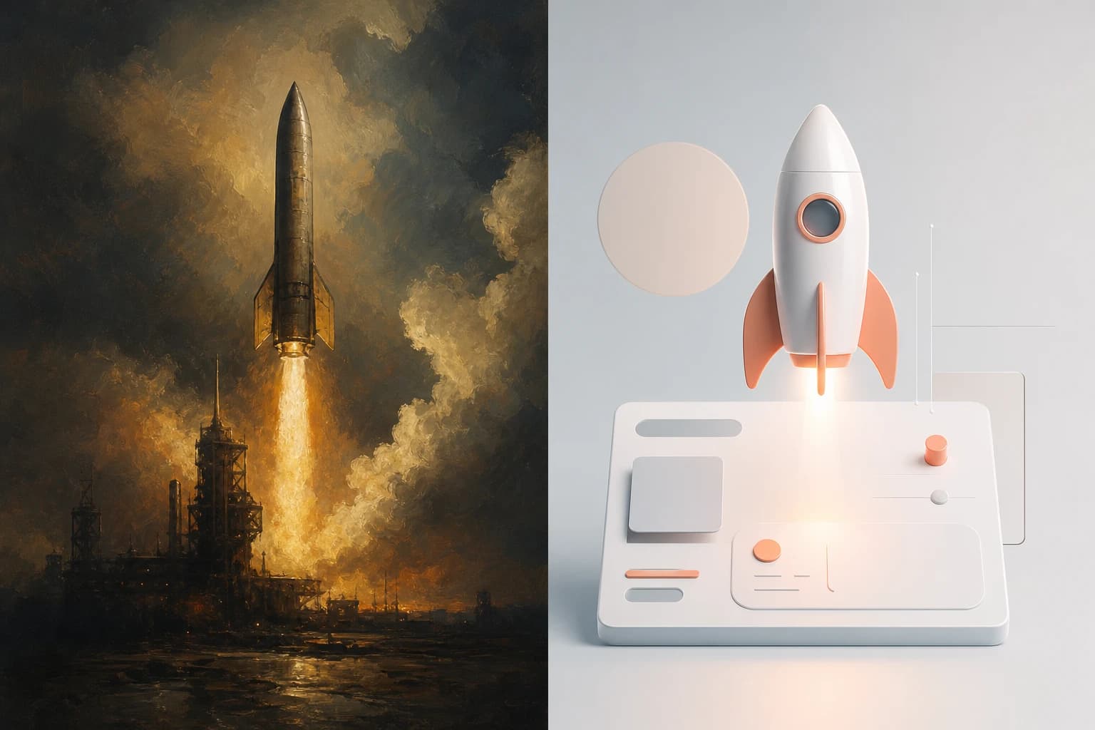
The visual difference between a unified and an ununified material and color palette is drastic. An ununified set might feature one icon with a rough plastic texture under a harsh blue light, while another has a smooth metallic finish under a warm yellow light. This creates a chaotic, disjointed look, as if the icons were haphazardly copied from entirely different apps. Conversely, a unified set where all icons share a soft, matte clay material, a consistent pastel palette, and subtle warm lighting provides a deep sense of visual stability. This cohesive approach reads as a single brand language, directly enhancing the professionalism and reliability of the service.
4. Mixing Multiple Icon Sets in a Single UI
Just because you created or downloaded beautiful 3D icons doesn't mean you should mix them recklessly into your existing screens. Combining flat 2D line icons with 3D icons on the same screen creates a highly cluttered interface.
The Solution: To maintain visual consistency without mixing multiple icon sets in a single UI, each icon set must be used consistently throughout the app. High-quality icon packs that offer hundreds of assets maintain their uniformity by strictly testing each icon. If you decide to introduce 3D icons, apply them with strict rules, such as using them exclusively for primary navigation or specific focal points.
5. Losing Clarity to Overly Complex Details and Inefficient Workflows
When working with 3D tools, it is easy to get bogged down in flashy effects like reflections, complex textures, and heavy shadows, forgetting the icon's original purpose. Overly detailed 3D icons become illegible on small screens.
The Solution: An icon's primary purpose is to express a concept quickly. Prioritize readability and simplify the form as much as possible.
Additionally, designers should avoid wasting time on repetitive manual modeling and background removal. Utilizing a dedicated 3D icon generator can effectively streamline this workflow. For example, by using the Oven AI Figma plugin, designers can leverage a "Brand Style Memory" feature. This allows the tool to remember pre-set lighting, camera angles, and material data, generating consistent 3D icons directly within the design workspace. Furthermore, these generated assets are automatically processed with transparent backgrounds (PNG), meaning designers do not need to manually mask or erase backgrounds. They can place the icons immediately onto the canvas, optimizing practical efficiency.
While 3D icons offer visual delight, they must be grounded in strict consistency and clarity. By checking for these five common mistakes and utilizing efficient workflow tools, you can complete a perfect 3D icon set that breathes life into your project without sacrificing usability.